Sign of the Swallow
This Port Melbourne story is reproduced with permission from Stephen Banham’s wonderful book Characters: Cultural stories revealed through typograpy.
‘Real estate development can be unkind to signage. The urgency to convert a site from industrial to residential often promotes a ‘scorched earth’ approach – complete erasure of what once occupied a site.
However, amid the crashing bricks and billowing dust there often lie the remnants of perhaps the most identifiable symbol of a building’s origins – its signage.
In the case of readily recogniseable sites, the removal of signage can not only strip away a building’s identity but also its social role as a landmark. Beyond any conspicuous architectural features specific to its purpose (e.g. a church or power station), very often it is the signage that gives the viewer a sense of the function, history and meaning of a building.
Threading as it is through the stories of architecture and industrial design, signage can offer a clear point of reference in ascertaining not just the vintage of a building but its larger social context.
Lettering integrated into facades, common during the modernist period, is now widely considered to be a natural extension of architectural preservation.
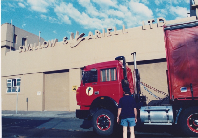
The conversion of the Swallow & Ariell biscuit factory in Port Melbourne into apartments in the mid-1990s demonstrates the complexity of this relationship. Although the Historical Buildings Council initially argued that destroying the striking Art Deco lettering would ‘reduce the heritage value’ of this very significant 1854 industrial complex, a permit was finally issued to remove them in 1994.
So down came the original pressed cement signage (lettering and swallow bird) over the loading bay.
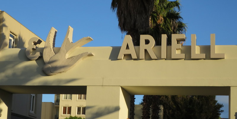
It was only many years later that a faithful replica of this signage was then installed over the same site, now the car park entrance.
But not all the original signage has been re-installed. Adopted as the company’s visual identity, the Swallow & Ariell biscuit factory had made a bird into a prominent local landmark. To proudly mark the seaside factory, a huge swallow-shaped sign was manufactured and mounted upon a towering pole overlooking the front of the building. Reputed to be visible from ships docking at nearby Station Pier it was said to spin around, always pointing in the direction of the wind.
Proudly illustrated on the front cover of the company’s centenary publication in 1954, the renowned swallow sign vanished in the 1960s, never to be seen again.’
Reproduced with permission from
Characters: Cultural stories revealed through typography by Stephen Banham